Tables to Idioms#
Acknowledgement#
Slides created by and for: Munzner, T. (2014). Visualization analysis and design. CRC press. [Mun14]
Used by permission of the author.
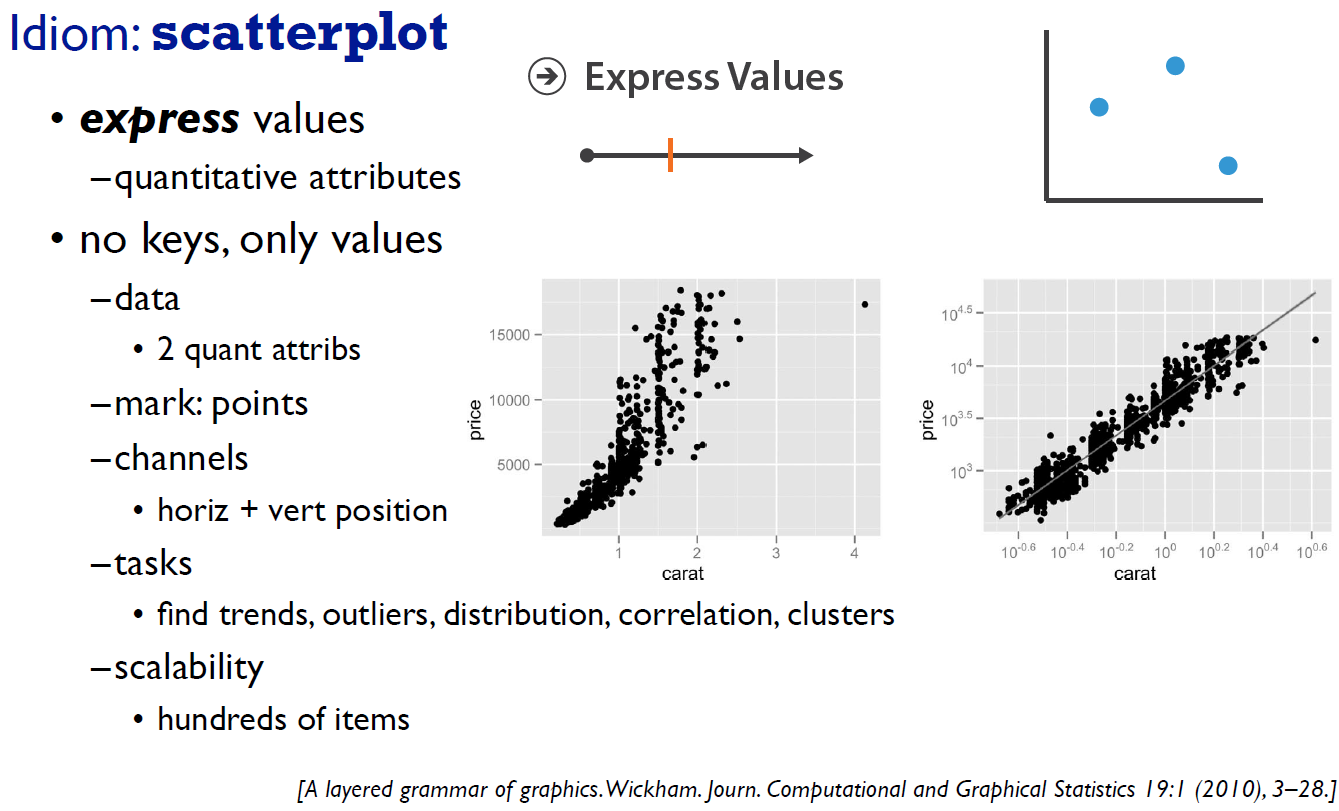
Image from: Wickham, H. (2010). A layered grammar of graphics. Journal of Computational and Graphical Statistics, 19(1), 3-28. [Wic10]
B Granger and J Grout. Jupyterlab: building blocks for interactive computing. Slides of presentation made at SciPy, 2016.
Tamara Munzner. Visualization analysis and design. CRC press, 2014.
Hadley Wickham. A layered grammar of graphics. Journal of Computational and Graphical Statistics, 19(1):3–28, 2010.
First the Data#
import matplotlib.pyplot as plt
import pandas as pd

url="https://raw.githubusercontent.com/owid/covid-19-data/master/public/data/vaccinations/us_state_vaccinations.csv"
data = []
data=pd.read_csv(url)
data = data.dropna() # removed NAs with 0s

### Remove the United States entries

data = data[data.location != "United States"]

data.total_vaccinations = data.total_vaccinations/100000
data.total_distributed = data.total_distributed/100000
data.people_vaccinated = data.people_vaccinated/100000
data.head()
| date | location | total_vaccinations | total_distributed | people_vaccinated | people_fully_vaccinated_per_hundred | total_vaccinations_per_hundred | people_fully_vaccinated | people_vaccinated_per_hundred | distributed_per_hundred | daily_vaccinations_raw | daily_vaccinations | daily_vaccinations_per_million | share_doses_used | total_boosters | total_boosters_per_hundred | |
|---|---|---|---|---|---|---|---|---|---|---|---|---|---|---|---|---|
| 263 | 2021-10-02 | Alabama | 45.44355 | 67.3828 | 25.86950 | 42.73 | 92.68 | 2094920.0 | 52.76 | 137.43 | 9583.0 | 10431.0 | 2127.0 | 0.674 | 2985.0 | 0.06 |
| 264 | 2021-10-03 | Alabama | 45.65230 | 67.3665 | 25.92096 | 42.89 | 93.11 | 2103203.0 | 52.87 | 137.39 | 20875.0 | 11389.0 | 2323.0 | 0.678 | 10683.0 | 0.22 |
| 265 | 2021-10-04 | Alabama | 45.79477 | 67.3623 | 25.95947 | 43.02 | 93.40 | 2109349.0 | 52.94 | 137.38 | 14247.0 | 12178.0 | 2484.0 | 0.680 | 14974.0 | 0.31 |
| 266 | 2021-10-05 | Alabama | 45.84378 | 67.4281 | 25.97448 | 43.07 | 93.50 | 2111925.0 | 52.97 | 137.52 | 4901.0 | 10470.0 | 2135.0 | 0.680 | 15821.0 | 0.32 |
| 267 | 2021-10-06 | Alabama | 45.94736 | 67.5796 | 26.00070 | 43.15 | 93.71 | 2115732.0 | 53.03 | 137.83 | 10358.0 | 11500.0 | 2345.0 | 0.680 | 19856.0 | 0.40 |
Acknowledgement#
Max Roser, Hannah Ritchie, Esteban Ortiz-Ospina and Joe Hasell (2020) - “Coronavirus Pandemic (COVID-19)”. Published online at OurWorldInData.org. Retrieved from: ‘https://ourworldindata.org/coronavirus’ [Online Resource]
Original Link: owid/covid-19-data (Accessed 3/11/2021) Source Link: owid/covid-19-data
Hunter, J. D. (2007). Matplotlib: A 2D graphics environment. IEEE Annals of the History of Computing, 9(03), 90-95.
Today’s and Yesterday’s date and data#
from datetime import datetime, timedelta

todaysDate = datetime.today()
yesterdaysDate = todaysDate  - timedelta(days=1)
yesterdaysDate = yesterdaysDate.strftime('%Y-%m-%d')
twoDays = todaysDate - timedelta(days=2)
twoDays = twoDays.strftime('%Y-%m-%d')

data[data.date==yesterdaysDate].head()
| date | location | total_vaccinations | total_distributed | people_vaccinated | people_fully_vaccinated_per_hundred | total_vaccinations_per_hundred | people_fully_vaccinated | people_vaccinated_per_hundred | distributed_per_hundred | daily_vaccinations_raw | daily_vaccinations | daily_vaccinations_per_million | share_doses_used | total_boosters | total_boosters_per_hundred |
|---|
Scatter Plot — Matplotlib 3.3.4 Documentation. https://matplotlib.org/stable/gallery/shapes_and_collections/scatter.html. Accessed 14 Mar. 2021.
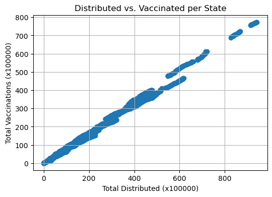
px = 1/plt.rcParams['figure.dpi']  # pixel in inches
fig, ax = plt.subplots(1,figsize=(600*px, 400*px))

ax.scatter(data.total_distributed, data.total_vaccinations)

# Add labels, a title and grid lines to the plot
ax.set_xlabel( 'Total Distributed (x100000)' )
ax.set_ylabel( 'Total Vaccinations (x100000)' )
plt.title( 'Distributed vs. Vaccinated per State' )
ax.grid()

# Show the figure (here in Jupyter)
plt.show( fig )
plt.close( fig )

Grouped Bar Chart with Labels — Matplotlib 3.3.4 Documentation. https://matplotlib.org/stable/gallery/lines_bars_and_markers/barchart.html. Accessed 14 Mar. 2021.
# creating the bar plot
yData = data[data.date==yesterdaysDate]
px = 1/plt.rcParams['figure.dpi']  # pixel in inches
fig, ax = plt.subplots(1,figsize=(1000*px, 300*px))
ax.bar(yData.location, yData.total_vaccinations, color ='maroon', width = 0.4)

# Add labels, a title and grid lines to the plot
ax.set_xlabel( 'Locations' )
ax.set_ylabel( 'Total Vaccinations (x100000)' )
plt.title( 'Vaccinations Yesterday per Location' )
# Show the figure (here in Jupyter)
plt.show( fig )
plt.close( fig )
# creating the bar plot
top10 = ["California","Texas","Florida","New York State","Illinois","Pennsylvania","Ohio","Georgia","North Carolina","Michigan"]
yData = data[data.date==yesterdaysDate]

top10Yest = yData[yData.location.isin(top10)]
px = 1/plt.rcParams['figure.dpi']  # pixel in inches
fig, ax = plt.subplots(1,figsize=(1000*px, 300*px))
ax.bar(top10Yest.location, top10Yest.total_vaccinations, color ='maroon', width = 0.4)

# Add labels, a title and grid lines to the plot
ax.set_xlabel( 'Locations' )
ax.set_ylabel( 'Total Vaccinations (x100000)' )
plt.title( 'Vaccinations Yesterday per Location' )
# Show the figure (here in Jupyter)
plt.show( fig )
plt.close( fig )
# creating the bar plot
top10 = ["California","Texas","Florida","New York State","Illinois","Pennsylvania","Ohio","Georgia","North Carolina","Michigan"]
yData = data[data.date==yesterdaysDate]

sortedData = yData.sort_values(by=['total_vaccinations'])
top10Yest = sortedData[sortedData.location.isin(top10)]
px = 1/plt.rcParams['figure.dpi']  # pixel in inches
fig, ax = plt.subplots(1,figsize=(1000*px, 300*px))
ax.bar(top10Yest.location, top10Yest.total_vaccinations, color ='maroon', width = 0.4)

# Add labels, a title and grid lines to the plot
ax.set_xlabel( 'Locations' )
ax.set_ylabel( 'Total Vaccinations (x100000)' )
plt.title( 'Vaccinations Yesterday per Location' )
# Show the figure (here in Jupyter)
plt.show( fig )
plt.close( fig )
Paired Bar Chart#
import numpy as np
# creating the bar plot
top10 = ["California","Texas","Florida","New York State","Illinois","Pennsylvania","Ohio","Georgia","North Carolina","Michigan"]
yData = data[data.date==yesterdaysDate]
sortedData = yData.sort_values(by=['total_vaccinations'])
top10Yest = sortedData[sortedData.location.isin(top10)]
twoData = data[data.date==twoDays]
sortedData = twoData.sort_values(by=['total_vaccinations'])
top102days = sortedData[sortedData.location.isin(top10)]
x = np.arange(len(sortedData[sortedData.location.isin(top10)].location)) # the label locations
width = 0.35 # the width of the bars
px = 1/plt.rcParams['figure.dpi'] # pixel in inches
fig, ax = plt.subplots(1,figsize=(1000*px, 300*px))
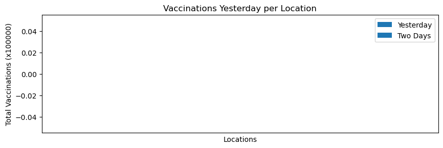
ax.bar(x - width/2, top102days.total_vaccinations, color ='steelblue', width = 0.4, label="Yesterday")
ax.bar(x + width/2, top10Yest.total_vaccinations, color ='maroon', width = 0.4, label="Two Days")
# Add labels, a title and grid lines to the plot
ax.set_xlabel( 'Locations' )
ax.set_ylabel( 'Total Vaccinations (x100000)' )
ax.set_xticks(x)
ax.set_xticklabels(sortedData[sortedData.location.isin(top10)].location)
ax.legend()
plt.title( 'Vaccinations Yesterday per Location' )
# Show the figure (here in Jupyter)
plt.show( fig )
plt.close( fig )
import numpy as np
# creating the bar plot
top10 = ["California","Texas","Florida","New York State","Illinois","Pennsylvania","Ohio","Georgia","North Carolina","Michigan"]
yData = data[data.date==yesterdaysDate]
sortedData = yData.sort_values(by=['total_vaccinations'])
top10Yest = sortedData[sortedData.location.isin(top10)]

twoData = data[data.date==twoDays]
sortedData = twoData.sort_values(by=['total_vaccinations'])
top102days = sortedData[sortedData.location.isin(top10)]

x = np.arange(len(sortedData[sortedData.location.isin(top10)].location))  # the label locations
width = 0.35  # the width of the bars

px = 1/plt.rcParams['figure.dpi']  # pixel in inches
fig, ax = plt.subplots(1,figsize=(1000*px, 300*px))
rects1 = ax.bar(x - width/2, top102days.total_vaccinations, color ='steelblue', width = 0.4, label="Two Days")
rects2 = ax.bar(x + width/2, top10Yest.total_vaccinations, color ='maroon', width = 0.4, label="Yesterday")
# Add labels, a title and grid lines to the plot
ax.set_xlabel( 'Locations' )
ax.set_ylabel( 'Total Vaccinations' )
ax.set_xticks(x)
ax.set_xticklabels(sortedData[sortedData.location.isin(top10)].location)

ax.legend()

def autolabel(rects):
    """Attach a text label above each bar in *rects*, displaying its height."""
    for rect in rects:
        height = rect.get_height()
        ax.annotate('{:.1f}'.format(height),
                    xy=(rect.get_x() + rect.get_width() / 2, height),
                    xytext=(0, 3),  # 3 points vertical offset
                    textcoords="offset points",
                    ha='center', va='bottom')


autolabel(rects1)
autolabel(rects2)


plt.title( 'Vaccinations Yesterday per Location' )
# Show the figure (here in Jupyter)
plt.show( fig )
plt.close( fig )